Customer Info
The Customer Info Block displays individual pieces of customer information, giving you precise control over what data to show and where to place it.
Overview#
Block Name: Customer Info
Category: RedFox Thank You
Purpose: Display specific customer data fields
Available In: Free and Pro
What It Does#
Unlike the Customer Details block which shows all information at once, Customer Info lets you:
- Choose exactly which field to display
- Place individual fields anywhere
- Create custom layouts
- Build flexible designs
When to Use#
Use This Block When:
- You need only specific fields (like email or phone)
- Creating custom layouts with individual data pieces
- Want more control over field positioning
Use Customer Details Block Instead When:
- You want to show complete customer information at once
- Displaying both billing and shipping addresses
- Creating a comprehensive order confirmation
Available Information Types#
You can display any of these customer fields:
- Customer Name – Full name (first + last)
- Email Address – Customer’s email
- Phone Number – Customer’s phone
- Customer Address – Customer’s address
- Customer City – Customer’s city
- Customer State – Customer’s state
- Customer Zip Code – Customer’s zip code
- Customer Country – Customer’s country
Block Settings#
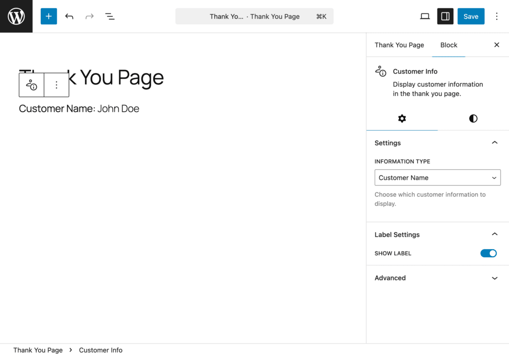
Select Information Type#
The most important setting:
- Select the Customer Info block
- In the sidebar, find Information Type dropdown
- Choose which field to display
- The block updates automatically
Label Settings#
Control the label visibility:
- Show Label: Toggle to display or hide the label (default: on)
Also, the label text can be edited directly in the block editor (supports bold and italic formatting).
Style Settings#
All style controls are found in the Styles tab of the block inspector panel.
Text#
Control content text styling (the displayed customer data value):
- Font Size: Adjust size for better readability
- Line Height: Improve spacing between lines
- Color: Match your brand colors
- Text Alignment: Left, Center, or Right
Pro typography options:
- Font Family
Pro— Access to 1,000+ Google Fonts - Font Weight
Pro— Light (300) to Extra Bold (800), dynamically updates based on selected font - Font Style
Pro— Toggle italic styling - Text Decoration
Pro— Underline, Strikethrough, or None - Letter Spacing
Pro— Fine-tune spacing between characters (-10 to 10) - Word Spacing
Pro— Adjust spacing between words (-10 to 50) - Text Transform
Pro— Uppercase, Lowercase, Capitalize, or None
Responsive Support: Supported.
Label Text#
Control the label styling (e.g., “Customer Name:”, “Email:”):
- Font Size: Adjust label size for readability
- Line Height: Improve spacing between label lines
- Color: Set color to differentiate labels from content
Pro typography options:
- Font Family
Pro - Font Weight
Pro - Font Style
Pro - Text Decoration
Pro - Letter Spacing
Pro - Word Spacing
Pro - Text Transform
Pro
Responsive Support: Supported.
Note: Text alignment is not available for labels.
Background#
Customize the block background:
Free:
- Background Color — Color picker with custom hex values
Pro:
- Background Image
Pro— Upload or select from media library with size, position, repeat, and attachment options - Background Gradient
Pro— Linear and radial gradients with pro-exclusive presets - Background Overlay
Pro— Color or gradient overlay with blend modes
Responsive Support: Supported.
Spacing#
Control block spacing:
- Padding: Internal space (inside the block) — Top, Right, Bottom, Left
- Margin: External space (around the block) — Top, Right, Bottom, Left
Features: Linked/unlinked sides, presets, box model visualization, auto values.
Responsive Support: Supported.
Border Pro#
Add and customize borders. Automatically available when the Pro version is active.
- Border Width — Set width in pixels or other units
- Border Style — Solid, Dashed, Dotted, and more
- Border Color — Full color picker
- Individual Sides — Set borders per side or all at once
- Border Radius — Round corners individually or all at once
Responsive Support: Supported.
Box Shadow Pro#
Add depth and dimension. Automatically available when the Pro version is active.
- Color — Shadow color with full color picker
- Horizontal Offset — Range: -100 to 100 (default: 0px)
- Vertical Offset — Range: -100 to 100 (default: 2px)
- Blur — Range: 0 to 200 (default: 4px)
- Spread — Range: -100 to 100 (default: 0px)
- Inset — Toggle for inner shadow
Set a shadow color to get started — sensible defaults are applied automatically.
Responsive Support: Supported.
Sizing Pro#
Control block dimensions with precision. Automatically available when the Pro version is active.
- Width / Height
- Min Width / Min Height
- Max Width / Max Height
Responsive Support: Supported.
Free vs Pro Styling Comparison#
| Feature | Free | Pro |
|---|---|---|
| Font Size, Line Height, Color, Alignment | ✅ | ✅ |
| Font Family | ❌ | ✅ |
| Font Weight, Font Style, Text Decoration | ❌ | ✅ |
| Letter Spacing, Word Spacing, Text Transform | ❌ | ✅ |
| Background Color | ✅ | ✅ |
| Background Image, Gradient, Overlay | ❌ | ✅ |
| Spacing (Padding & Margin) | ✅ | ✅ |
| Border & Border Radius | ❌ | ✅ |
| Box Shadow | ❌ | ✅ |
| Sizing (Width, Height, Min/Max) | ❌ | ✅ |
Comparison with Customer Details#
| Feature | Customer Info | Customer Details |
|---|---|---|
| Shows all info at once | ❌ No | ✅ Yes |
| Individual field control | ✅ Yes | ❌ No |
| Custom layouts | ✅ Yes | ❌ Limited |
| Ease of use | Requires setup | ✅ Easy |
| Best for | Custom designs | Quick setup |