Inline Container
The Inline Container Block lets you place blocks side-by-side instead of the default vertical stacking. Perfect for creating multi-column layouts where you want blocks to appear next to each other.
Overview#
Block Name: Inline Container
Category: RedFox Thank You
Purpose: Arrange blocks horizontally (inline/side-by-side) instead of vertically
Available In: Free and Pro
What It Does#
The Inline Container allows you to:
- Place blocks side-by-side (horizontally)
- Create multi-column layouts
- Control alignment and spacing between inline blocks
- Build responsive designs that adapt to different screen sizes
- Arrange content in rows instead of stacking vertically
Think of it as a container that breaks the default WordPress behavior of stacking blocks vertically. Instead, blocks inside this container can sit next to each other horizontally, like columns in a table row.
When to Use#
Use Inline Container For:
- Multi-column information displays
- Side-by-side block arrangements
- Custom header/footer sections
- Responsive grid layouts
- Flexible content organization
Use Regular Blocks Instead For:
- Simple single-column content
- Standard blog-style layouts
- When WordPress Columns block is sufficient
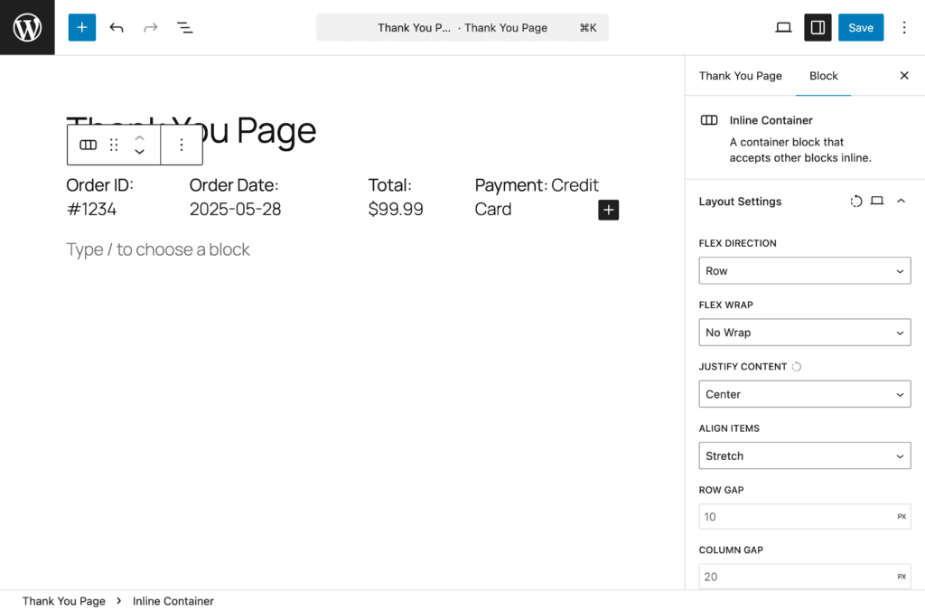
Block Settings#
Layout Settings#
Configure how child blocks are arranged within the container.
Flex Direction – Controls how blocks are arranged:
- Row (default) – Blocks appear side-by-side, left to right
- Row Reverse – Blocks appear side-by-side, right to left
Flex Wrap – Controls whether blocks wrap to new lines:
- No Wrap (default) – All blocks stay on one row
- Wrap – Blocks wrap to next row if they don’t fit
- Wrap Reverse – Blocks wrap in reverse order
Justify Content – Controls horizontal spacing:
- Flex Start – Blocks align to the left
- Flex End – Blocks align to the right
- Center – Blocks centered
- Space Between – Blocks spread with space between
- Space Around – Equal space around each block
- Space Evenly – Even spacing between and around
Align Items – Controls vertical alignment:
- Stretch (default) – Blocks stretch to match height
- Flex Start – Blocks align to top
- Flex End – Blocks align to bottom
- Center – Blocks centered vertically
- Baseline – Text baselines align
Row Gap – Vertical space between rows (supports px, em, rem, %, vw, vh units)
Column Gap – Horizontal space between blocks (supports px, em, rem, %, vw, vh units)
Responsive Support: Supported. Each layout setting can be configured independently for desktop, tablet, and mobile.
Text#
Style text content within the container:
- Font Size: Adjust size for better readability
- Line Height: Improve spacing between lines
- Color: Match your brand colors
Pro typography options:
- Font Family
Pro— Access to 1,000+ Google Fonts - Font Weight
Pro— Light (300) to Extra Bold (800), dynamically updates based on selected font - Font Style
Pro— Toggle italic styling - Text Decoration
Pro— Underline, Strikethrough, or None - Letter Spacing
Pro— Fine-tune spacing between characters (-10 to 10) - Word Spacing
Pro— Adjust spacing between words (-10 to 50) - Text Transform
Pro— Uppercase, Lowercase, Capitalize, or None
Note: Text alignment is not available for this block.
Responsive Support: Supported.
Background#
Customize the block background:
Free:
- Background Color — Color picker with custom hex values
Pro:
- Background Image
Pro— Upload or select from media library with size, position, repeat, and attachment options - Background Gradient
Pro— Linear and radial gradients with pro-exclusive presets - Background Overlay
Pro— Color or gradient overlay with blend modes
Responsive Support: Supported.
Spacing#
Control block spacing:
- Padding: Internal space (inside the block) — Top, Right, Bottom, Left
- Margin: External space (around the block) — Top, Right, Bottom, Left
Features: Linked/unlinked sides, presets, box model visualization, auto values.
Responsive Support: Supported.
Border Pro#
Add and customize borders. Automatically available when the Pro version is active.
- Border Width — Set width in pixels or other units
- Border Style — Solid, Dashed, Dotted, and more
- Border Color — Full color picker
- Individual Sides — Set borders per side or all at once
- Border Radius — Round corners individually or all at once
Responsive Support: Supported.
Box Shadow Pro#
Add depth and dimension. Automatically available when the Pro version is active.
- Color — Shadow color with full color picker
- Horizontal Offset — Range: -100 to 100 (default: 0px)
- Vertical Offset — Range: -100 to 100 (default: 2px)
- Blur — Range: 0 to 200 (default: 4px)
- Spread — Range: -100 to 100 (default: 0px)
- Inset — Toggle for inner shadow
Set a shadow color to get started — sensible defaults are applied automatically.
Responsive Support: Supported.
Sizing Pro#
Control block dimensions with precision. Automatically available when the Pro version is active.
- Width / Height
- Min Width / Min Height
- Max Width / Max Height
Responsive Support: Supported.
Free vs Pro Comparison#
| Feature | Free | Pro |
|---|---|---|
| Layout Settings (Flex Direction, Wrap, Justify, Align, Gaps) | ✅ | ✅ |
| Text (Font Size, Line Height, Color) | ✅ | ✅ |
| Text Typography (Font Family, Weight, Style, etc.) | ❌ | ✅ |
| Background Color | ✅ | ✅ |
| Background Image, Gradient, Overlay | ❌ | ✅ |
| Spacing (Padding & Margin) | ✅ | ✅ |
| Border & Border Radius | ❌ | ✅ |
| Box Shadow | ❌ | ✅ |
| Sizing (Width, Height, Min/Max) | ❌ | ✅ |